Royston Labels' add innovation to new look whisky branding
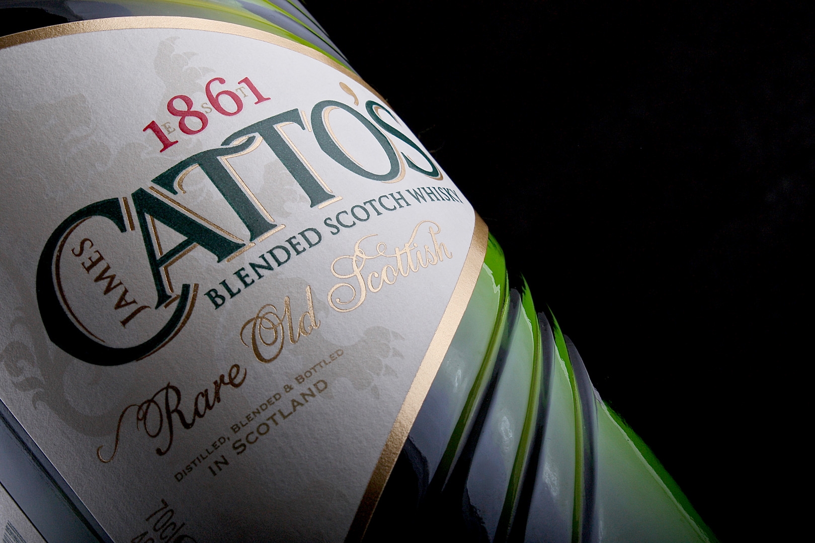
A new brand identity for International Beverage's blended Scotch whisky Catto's has been
captured in a striking new bottle and packaging design. The result is a dynamic new look which
captures the history of the whisky's founder, James Catto, an ambitious businessman and pioneer
of blending who was one of the first to ship whisky around the world when Catto's was established
in Aberdeen in 1861.
The new bottles were produced by Ardagh Group from a new brand proposition, with primary and
secondary packaging designs by JDO Brand & Design; the label was produced by Royston Labels.
The label shape, which takes inspiration from a boat's bow, was designed to sit within the bottle's
wave feature intensifying the lines created in glass. From concept designs, Royston Labels had to
combine many different decoration techniques in order to achieve the desired end result.
Both front and back labels are printed in 4 special colours. A bespoke satin tactile varnish,
specifically formulated for this particular label, was then used to enhance the main branding. The
labels incorporate hot foil, which has been used with both solid areas and fine detail, testing the
process on a textured paper specified for this range; Royston Labels invested in new equipment to
ensure the absolute best quality from this particular process.
A further challenge, with the label being a unique triangular shape, was fitting the label into the
front and back recesses on the bottle; this made it more difficult to strip waste and maintain an
exact register during die-cutting.
Royston Labels managing director, Paul Clayton, said: "Producing the labels threw up a number of
complexities. Nevertheless, our teams of experienced technicians ensured that the final result was
beyond expectations, even down to the speed of the final pass on press, which had the brand
manager commenting that "it was the quickest press approval that I have ever been to".
"It was a pleasure working with this Client as they had a complete understanding of the challenges
faced from a label production perspective."
Catto's new look aims to give the brand a strong identity in the upper standard segment of the
mainstream whisky category - launching first in Canada, Russia and Spain, then rolling out globally
in 2016.

