Packaging redesign for own label wine range at Booths by Smith&+Village helps boost sales by 4.3 per cent
30 January 2017
Packaging redesign for own label wine range at Booths by Smith&+Village helps boost sales by 4.3 per cent
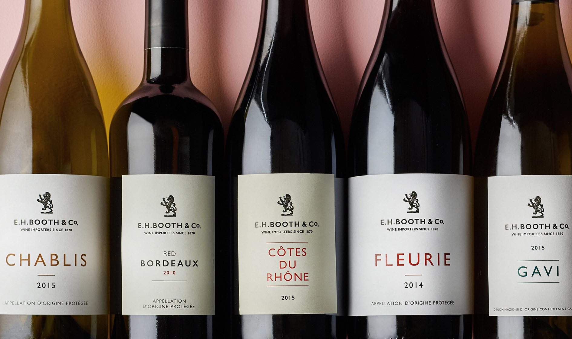
A redesign of packaging for Booths’ own label wine by creative and strategic branding partnership Smith&+Village, which played on the supermarket’s heritage as a wine importer, contributed to an increase in sales of 4.3 per cent over the Christmas period.
The rebranded 50cl Vintage Port was the best performing redesigned product, smashing last year’s sales of the 75cl bottle, with a volume sales increase of 440 per cent.
The second largest growth in the category was in the more premium wines, such as Chablis, which increased by 162 percent, Rioja by 147 per cent and the Bordeaux Rouge by 46 per cent.
Smith&+Village elevated the range by using the high-end supermarket’s crest on the front of the label, together with its original name EH Booths & Co, to reflect its history as a wine importer and create own label packaging which customers would be proud of.
Exuding confidence
Smith&+Village’s strategy to boost sales was to stop customers thinking of Booths’ offering as supermarket wine, and reposition the retailer as a wine merchant. The supermarket has been importing wine for almost 150 years.
The packaging design was selected to create the kind of bottle customers would want to display on the dinner table.
Richard Village, Director of Smith&+Village, said: “Whatever supermarkets do to counter it, there is still some stigma in customers’ minds about putting supermarket wine on the table at a dinner party. We’ve got around that by playing on Booths’ heritage as a wine merchant.
“They have imported wine since 1870 and for the most part work with smaller, independent wine makers who are often family businesses like them. Playing with this and putting the brand mark centre stage on the front of the bottle makes it exude confidence.”
Grand designs
A variety of finishes, papers and colours, as well as text, direct print, varnishes and pearlessence, make the supermarket’s own label range stand out.
Packaging design is stripped back and missing the frequently used wine category design cues of illustrations, vineyards and chateaux. The font is based on a Gill Sans in light regular or semi bold which is an old English font selected for Booths’ logo.
Debrah Smith, Creative Director, Smith&+Village, added: “From a design and visual point of view, supermarkets tend to go for a derivative, cookie cutter look. We chose packaging design which would make it stand out from the competition.”

