jkr creates refreshed brand identity for IRN-BRU
A.G. Barr has unveiled a completely refreshed brand identity for IRN-BRU, in the brand's first significant redesign since 2008. The branding, design and visual identity was all created by brand design consultancy jones knowles ritchie (jkr).
Bold spirit
The main objective for the rebrand was to refresh and modernise the design, to deliver a clearly defined brand presentation which expressed IRN-BRU's heritage and its association with strength.
Stephen McDavid, Design Director at jkr, says: "One of our main objectives was to bring the brand's two variants - original and sugar free - closer together, creating a strong masterbrand identity. We also put a lot of emphasis on modernising the brand, whilst respecting its rich visual heritage."
The agency looked at the brand's archives, dating back to 1901, in order to identify and revitalise original and unique design cues that would help to tell the IRN-BRU story, hero its bold spirit and forge a connection with consumers.
Made from girders
The rebrand was heavily inspired by the IRN-BRU's famous 'Made From Girders' advertising campaign and strapline. Research showed that this still resonated with loyal consumers, with the new design unlocking the idea of strength, industry and authenticity associated with this concept.
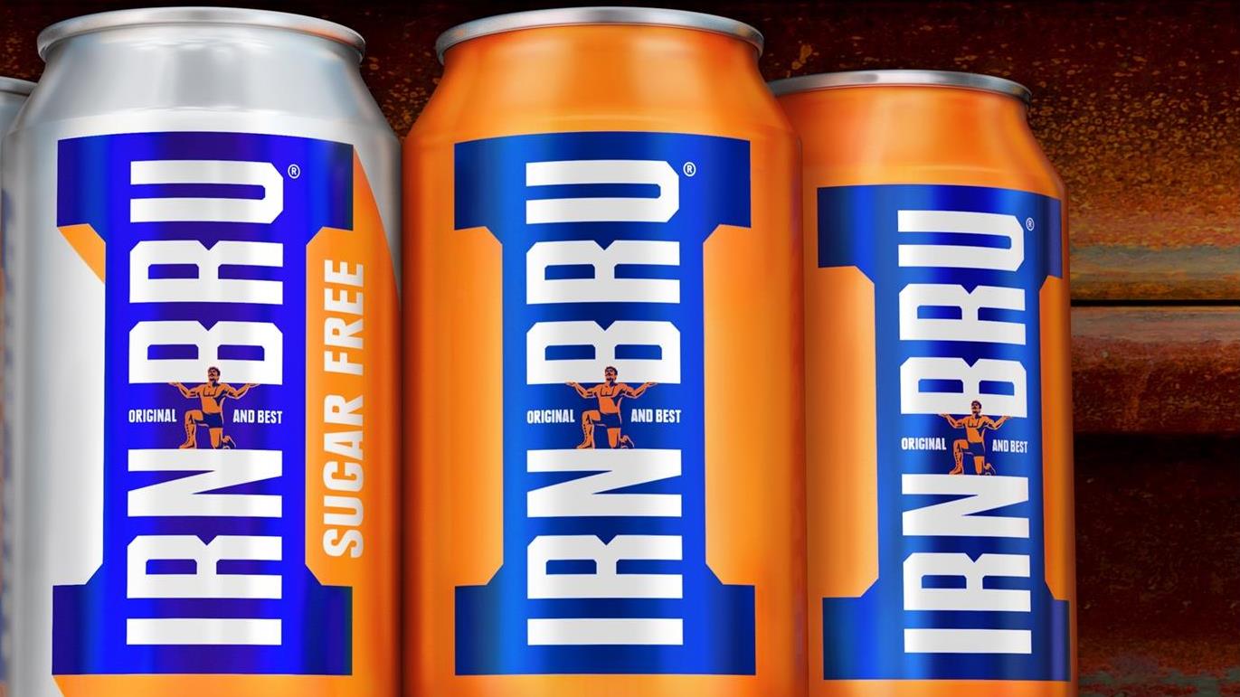
Taking this as inspiration, jkr created a new icon for the brand, forged from the end of a girder to create an instantly recognisable letter 'I'. Acknowledging the distinctiveness of the brand's existing colour palette, jkr leveraged the blue and orange to maximum effect to ensure IRN-BRU was instantly visible at shelf.
Stephen McDavid at jkr adds: "We worked closely with illustrator Chris Mitchell to resurrect the strong man from the original label, placing him back proudly at the centre of the brand. The wordmark has also been redrawn to ensure all the equities are communicating IRN-BRU's bold strength.'
jkr has also created a consistent, flexible look and feel for the brand world that adapts the new design equities to allow for rich story telling.
Adrian Troy, Head of Marketing at A.G. Barr, explains: "Shapes, colours and iconography are essential components of the IRN-BRU brand and we realise how vital design and visual identity are in making our brand connect with consumers.
It was crucial that our new look retained the cues that make our brand so memorable and brought forth our unique strength and heritage. It also needed to work for our existing base of loyal and passionate consumers whilst appealing to a new wave of consumers."
The new designs will be rolled out across cans, bottles, brand communications and external packaging, and include a new look sugar free variant, which uses a silver background highlighted by the iconic orange and blue visuals.
ikr has a long-lasting relationship with A.G. Barr, and last year designed IRN-BRU's hugely successful Tartan Army campaign, which won Silver at the 2016 DBA Design Effectiveness Awards in February this year.

