16 March 2015
SENSEO brand re-design by international brand design agency Design Bridge
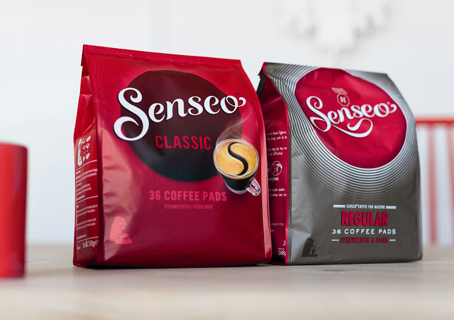
International brand design agency, Design Bridge, has re-designed the SENSEO brand, including new packaging which has just launched across Europe. SENSEO, a coffee brand that stands for convenient coffee enjoyment, allows consumers to explore a broad range of coffee without all the fuss. Design Bridge redefined the SENSEO brand personality with the client team unlocking its optimistic sense of adventure. Elements of SENSEO's iconic design past - in particular the SENSEO 'S' have been crafted and put back where they belong, taking centre stage as the brands icon of coffee quality and taste.
An iconic brand
SENSEO gives people all over the world the freedom to explore different coffee experiences at home, every day. However, it was felt that the packaging had lost some of its personality and visual connection to coffee. Design Bridge was asked to help define and capture the brands truth and personality. From there, the brief was to develop the new primary identity, new packaging design and
brand world guidelines. SENSEO has an international reach and the design needed to work across markets and cultures, supporting future product developments and innovations.
An iconic new design: coffee is the hero
Design Bridge explored the brand's past as the single-serve innovator, the creative archive and relevant consumer insights. It was important to reintroduce much more overt coffee appetite to the design and improve brand stand out at shelf. The new-look identity and primary design assets were crafted in such a way as to communicate the inherent optimism of the brand. The design style is
intuitive and open-minded, encouraging consumers to take an adventure through coffee varieties.
The SENSEO Logo...
The new packaging design features the crafted SENSEO primary identity (brand-mark) owning the consistent brown circle, bold, confident and grounded in coffee. Moving away from multiple versions of the brand-mark (colour-ways), the new consistent approach delivers much improved brand standout at shelf.
The Distinctive 'S'...
The design reclaims the use of a distinctive 'S' in the coffee crema layer, linking the brand and product story. Using glass cups to celebrate the coffee, and careful consideration of the angle of those cups ensures the right balance of distinctive brand asset, and full view of the coffee within the glass. The coffee is the hero.
Making more sense at shelf - simple communication of the range and variant
One of the new designs strengths is that the variant naming is now locked-up within the brand-mark circle itself, linking brand to flavour. New patterns have been handcrafted, to truly reflect the differing taste profiles of each range of coffee, drawn from the brand personality. Design Bridge is hugely proud to be part of the SENSEO brand story, following on from the successful re-launch of Douwe Egberts earlier this year, and Claire Parker, Executive Creative Director of Design Bridge, said: "Not only does the packaging visually distinguish SENSEO from its competitors, but, importantly, it reinforces the brands unique personality. This was a great lesson in the power of packaging to inform choice through clear navigation and respect for the assets that belong to the brand in consumers hearts and minds."
Media contact
Marguerite Rubens
PR Coordinator
Design Bridge
Tel: +31 (0) 20 520 60 30
email: marguerite.rubens@designbridge.com

